Published on
Shifting to Responsive Web Design

Summary
UCSD’s deployment of responsive design transformed thousands of web pages to optimally function on any device on the market today– and makes them future-ready for devices yet to be developed.
Our redesigned campus site launched using responsive design in January, 2012. Since then, we’ve applied responsive design to over 30 academic and administrative websites in the campus Content Management System (CMS). In addition, our Web Application decorators were retrofitted to be responsive; so applications now adjust and conform to any device.
As opposed to frameworks that are designed to only support mobile devices, responsive design lets developers build one set of code– and their site or app looks great on everything from high-resolution desktop screens, all the way down to the smallest phone.
Project Description
The age of the desktop as the dominant computing platform is over!
Computing began in the 60s with the mainframe. In the 80s, the desktop dominated. In the last couple years, phones and tablets have overtaken desktops and laptops in terms of sales. They are becoming the most important devices we use to access information over the Internet.
In about 2 months there will be more connected phones in the world than people. Think about that. We just crossed the threshold of 7 billion people in the world. Pretty soon there will be more connected phones than people, according to Phonecount.com. Developing nations such as China are leapfrogging hard line connections all together and going straight to establishing wireless networks.
And it’s not just phones. By the fall of this year, more tablets will be sold than PCs. With the popularity of the iPad and emergence of lower-cost Android models, tablets are cannibalizing PC sales. In many cases, students are bringing tablets to school as their primary way of accessing campus websites and applications.
The challenge for IT has been how to keep up with this new era of computing, given budget and resource challenges.
UC San Diego was an early adopter of mobile technology. In 2009, we collaborated with Stanford undergraduate students to develop an iPhone app using existing data feeds and web services. We were one of the first public universities with an iPhone app. It was pretty cool at the time.
The Stanford students started a company that was bought out by Blackboard. And as mobile technology advanced, other mobile platforms came onto the scene such as Android. There was a need to be agile in this space, as the technology was evolving rapidly!
The vendor was slow to respond so we decided to bring pull development in-house and replace the app with the Mobile Web Framework (MWF) platform, originally developed at UCLA.
MWF is awesome!
The Mobile Web Framework is great. It allowed us to migrate away from the vendor and utilize a device -agnostic solution to build mobile web apps in a distributed way on our campus.
All told, we now have 22 mobile apps built by six different IT departments that make up m.ucsd.edu.
That’s great for the 22 mobile apps. But what about the thousands of web pages we have in the CMS?
In the summer of 2011, we embarked upon a project to redesign the campus website and bring it in line with the latest campus branding standards.
When diving into the analytics, we noticed a tremendous increase in traffic from mobile devices and tablets to the UCSD home page:
- Over the past year, mobile traffic increased at about a half percent per month.
- Mobile views were now over 13 percent. That’s double from last year, and over 1,700 views per day.
The birth of Responsive Design
Making our new home page look great on all devices was a high priority, so we began exploring our options. A technique called responsive design was gaining traction.
It began simply as an idea from Ethan Marcotte, who wrote an article in May of 2010 about how we could use existing web technologies in a way that allowed web pages to adapt to the resolution of the device used when viewing sites.
Responsive design started out as more of a theory, but as adoption began, examples were beginning to emerge.
Responsive Design allows web developers to:
- Dynamically shift where elements are placed on the page
- Scale images to different resolutions
- Expose or hide certain elements at different resolution breakpoints.
Knowing we’d be one of the first universities to implement responsive design, there was a hesitation to use it on an especially high-profile website, such as the campus home page. We didn’t have budget to bring in outside developers or experts, but the team felt a sense of passion and commitment to utilizing this cutting-edge approach. We understood we’d need to “learn on the fly,” and the project team was committed to spending the overtime hours. It was exciting to be an early adopter!
At the coding phase, we started thinking ahead. Not only did we want the campus website to leverage responsive design, but we also felt that all websites in the CMS should be able to take advantage of our work on this project. We found that open-source frameworks were emerging to ensure standardization and cross-browser compatibility. After some research, we selected a framework called HTML5 Boilerplate. The use of a framework could jumpstart responsive development for the campus site. This in turn would be applied to the CMS templates used by UCSD academic and administrative units for their websites.
The next step was to build the CMS templates. We use Hannon Hill Cascade Server for our CMS. The CMS vendor didn’t have much experience with clients using responsive design, so we certainly blazed some trails. We translated our initial HTML & CSS markup into the CMS templates. With some trial and error, we were able to build the templates to work with responsive design.
Rolling out Responsive Design to the Rest of the UCSD Campus
Since implementing responsive design on the campus website, we’ve been deploying it across many of the sites in the CMS. One of the lessons learned was building CMS templates from the ground-up to use responsive design was easier than retrofitting templates that were built without responsive design in mind.
That said, we were able to work out the kinks, and in March 2012, we began rolling out responsive design to as many web properties as possible.
Our goal is to have all the sites retrofitted by the next calendar year. Of course, any new site that comes on board to the CMS from this point forward is responsive by default. Responsive design is now part of any web development project we do. In September, we launched our Admissions website redesign using responsive design. Based on research from Noell Levitz, we knew that more than half of prospective students were checking our Admissions content on their mobile devices. It only made sense to ensure the layout was optimized for any device they’d be using (as you can see below).
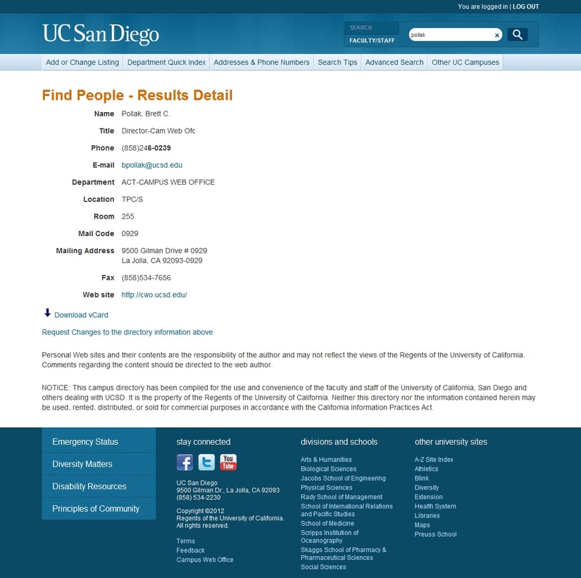
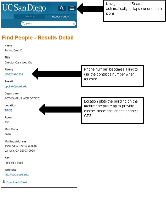
Responsive Web Design also works for applications. For example, we used responsive design on the redesign of the online Faculty/Staff Directory. We used responsive techniques to hide and show different elements at various breakpoints. Some of the things we did were
- When touched, the phone number calls the person at the mobile breakpoint. This is hidden at all other resolutions.
- The office location of the person listed links to our mobile campus map. Using the phone’s GPS, personalized walking and driving directions can be accessed to that person’s office building. Again when browsing on the desktop, this feature is hidden.
Similar to what we did for the CMS templates, we retrofitted our application decorators to be responsive. We made these tools available as a self-service to campus IT units and began marketing their availability. We knew the more resources leveraging our solution, the better.
Below, you can see the two different views of the Directory. The screenshot at the top shows what displays when viewing from your desktop. The second screenshot shows how the screen looks on a mobile device. Note the phone number and location turn into links on the mobile view. The phone link dials the number and the location link plots the building on the mobile campus map.
There are advantages of continuing to support the Mobile Web Framework to develop mobile web apps.
Slower connection speeds that exist for mobile devices continue to be an issue. The Mobile Web Framework comes packaged with certain features such as image compression that allow for optimization. With responsive design, on the other hand, mobile devices will download all the assets including high-resolution images and scale them down for the phone.
Technologies are emerging, however, to address performance, including server side components to deliver “right-sized” elements depending on the device accessing the site or app.
Although Responsive Web Design is still new, it’s gained traction quickly. I’d be surprised if responsive design wasn’t the de-facto standard for web development within the next year.
Author Perspective: Administrator


